Color notes: Boulder Barrel Project
One of the things I go for in my work is a sense of ease. I want it to look like it breathed itself into being which, counterintuitively, takes a degree of planning to pull off consistently. While every project is different, planning for me can include thumbnail sketches, doing materials tests, color tests and cutting/collage exercises to help work out ideas about composition.
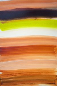
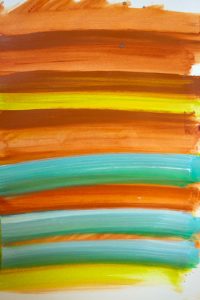
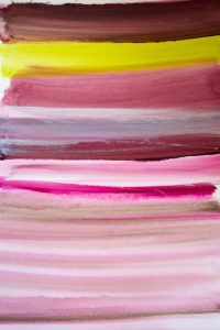
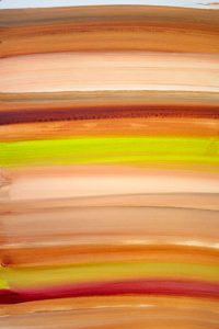
Here are some of my color notes for the Boulder Barrel Project. I chose Mars yellow, transparent red iron oxide, titanium white and green gold for this project after spending time looking at neighborhood architecture and landscaping in Boulder, Colorado where my barrel will most likely end up sited. Accent colors are still up for grabs and could include raw umber, teal and magenta. I’m using Golden acrylics, a mix of heavy body, fluid and high flow paint.
Still on the fence about raw umber. But the Mars yellow, transparent red iron oxide, titanium white and green gold, all special favorites, are keepers, for sure.
While teal is a natural complement to terra cotta, I’ve decided not to use it for this project because the combo reads too tritely Southwest to me.
Contemplating magenta. Do I like what it adds to the palette? Or, all of a sudden, are we looking at too many colors here?


